Wingspan
My Role
Tools
Duration
- User Experience (UX) Researcher
- User Experience (UX) Designer
- User Interface (UI) Designer
Deliverables
Research, Ideation, Prototyping, Design solution Catalog, Interaction Design
Tools
Figma, Dovetail, Adobe Illustrator, Adobe Indesign, Adobe Photoshop
Duration
5 Months
Project Background
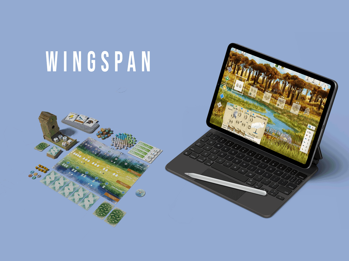
Wingspan, created by Elizabeth Hargrave and released by Stonemaier Games, presents players with a strategic and visually captivating gameplay experience. This game incorporates educational elements and showcases stunning artwork. The objective is to attract a variety of bird species to personal preserves, earning points through tasks such as managing habitats, laying eggs, gathering food, and utilizing species-specific abilities. Both physical and digital versions of the game are available, with the digital version launching subsequent to the success of the physical board game. While the digital adaptation effectively captures the mechanics and visual aspects, it falls short in fully addressing the challenges that arise due to the absence of physical components.
Wingspan, created by Elizabeth Hargrave and released by Stonemaier Games, presents players with a strategic and visually captivating gameplay experience. This game incorporates educational elements and showcases stunning artwork. The objective is to attract a variety of bird species to personal preserves, earning points through tasks such as managing habitats, laying eggs, gathering food, and utilizing species-specific abilities. Both physical and digital versions of the game are available, with the digital version launching subsequent to the success of the physical board game. While the digital adaptation effectively captures the mechanics and visual aspects, it falls short in fully addressing the challenges that arise due to the absence of physical components.
Project Goal
Informed by user insights and an extensive literature review on cognitive processes, the project aimed to pinpoint areas for improvement in the digital version of board games, with the ultimate goal of enhancing user experiences and reducing cognitive mental workload.
1. Replicating the tactile experience of the physical version to enhance strategic gameplay in the digital format.
2. Enhancing in-game communication to foster social presence within the digital platform.
1. Replicating the tactile experience of the physical version to enhance strategic gameplay in the digital format.
2. Enhancing in-game communication to foster social presence within the digital platform.
Project process

Design Solution
● Personal Interest :
Transition between mediums
I have consistently been captivated by the manner in which users engage with content through distinct mediums, and this curiosity is particularly amplified due to the extension of my undergraduate project that entailed the transition from a book format to a mobile application.● Available in both physical and digital formats.
After the initial release of the board game in 2019, a digital adaptation of the physical game was introduced in 2020. Also the game has enough recognition and popularity which helps data collection and user testing.● Sufficient experience to comprehend the game.
Having acquired substantial experience playing the physical board game and possessing all of its expansions, I have developed a comprehensive comprehension of the game mechanics. This profound familiarity aids me in discerning the behaviors exhibited by interviewees and participants during observations.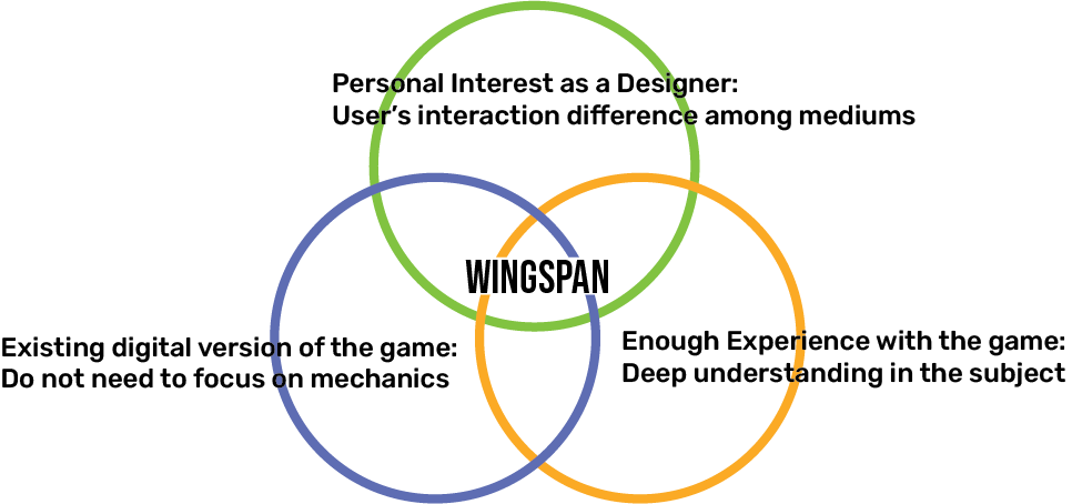
Understanding Wingspan
● About the game
Designed by Elizabeth Hargrave and published by Stonemaier Games, it offers a strategic gameplay experience with stunning artwork and educational components. Players aim to attract diverse bird species to their preserves, earning points through habitat management, egg-laying, food gathering, and species-specific abilities.
In Wingspan, the primary objective is to have the highest score by the end of the game. To achieve a winning position, players should focus on a combination of effective strategies and point-generating actions.
1. Play a bird card on the board
Each bird card in your wildlife preserve has a point value indicated on the card. By attracting more bird cards and populating your preserve (playing the card on your board), you can accumulate points based on their values.
2. Bonus card
If you achieved the goal in your bonus card, you gain points
3. End of the round goal
Each round has a randomized goal, which provide specific conditions for earning points.. According to who achieve the goal the most, point will be assigned,
4. Tucked cards, laid eggs, food on card
Each tucked card, egg and food on card is one point. You can
tuck card or put food on the cards depending on the bird power
and lay egg by one of the action.
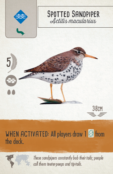
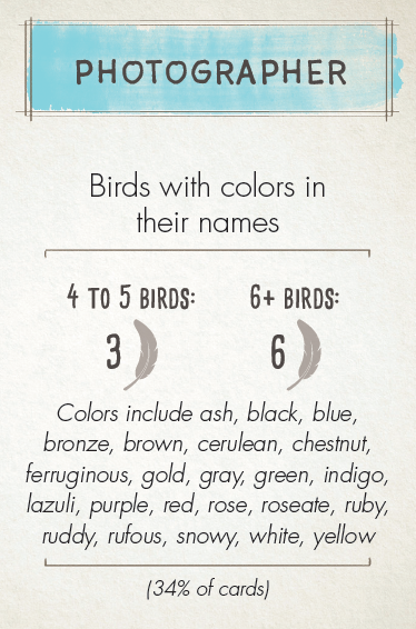


Wingspan is known for its high-quality components, including beautifully illustrated bird cards, custom wooden dice, and a visually appealing game board. By conducting a game component analysis comparing the physical and digital iterations of the game, several similarities and distinctions were identified.
1. Coherence in visual identities
The digital version of the game retained the artwork, crafted by Natalia Rojas and Ana Maria Martinez Jaramillo, and also maintained consistent symbolism to depict the distinctive characteristics of each bird, just as seen in the physical board game.
2. Diverse sensory interaction
The digital version of the game retained the artwork, crafted by Natalia Rojas and Ana Maria Martinez Jaramillo, and also maintained consistent symbolism to depict the distinctive characteristics of each bird, just as seen in the physical board game.
2. Diverse sensory interaction
3. Seperated pages for habitats
4. Automated game components
5. Lack of social interaction
4. Automated game components
5. Lack of social interaction
Understanding the User
Interview
Data Collection
6 Interviewees from Reddit Wingspan community
2 participants : Played only physical version
4 participants : Played physical and digital version
Data Analysis
Primary transcription by Dovetail and checked manually
Initial Open Code and Thematic Analysis
Particiaptory Observation
Data Collection
3 Participatory observation
1 observation with 4 players with physical version
1 observation with 1 player with physical boardgame
1 observation with 2 players with digital game
Data Analysis
Fieldnote and screenshot from the recorded video focusing on social interaction, decision making, and sensory interaction
There some gap between users cognitive process
1. Different Mental Workload
Digital version of the game performs well on tracking the current status of players like
● current points they earned
● progress in bonus card and end of the round goal.
However it does not support the future decision making due to lack of materiality and visual representation.
2. Lack of sense of social presence
While social interaction is one of the key aspects of the physical board game, current online versions of the game do not suppor any kinds of social interaction other than the game play.
Users are using other platforms like Discord, Zoom with the game.
Design Goal
1. Able to rearrange the bird card in player’s hand
2. Able to separate the tucking or discarding cards
3. Redesign the cube representation
4. Design a communication and customization tool
* Kriz, W. C. (2020). Gaming in the Time of COVID-19. Simulation & Gaming, 51(4), 403–410. https://doi.org/10.1177/1046878120931602
2. Able to separate the tucking or discarding cards
3. Redesign the cube representation
4. Design a communication and customization tool
Includes the embodied experience and related tacit knowledge of the participants*
* Kriz, W. C. (2020). Gaming in the Time of COVID-19. Simulation & Gaming, 51(4), 403–410. https://doi.org/10.1177/1046878120931602
Design Solution
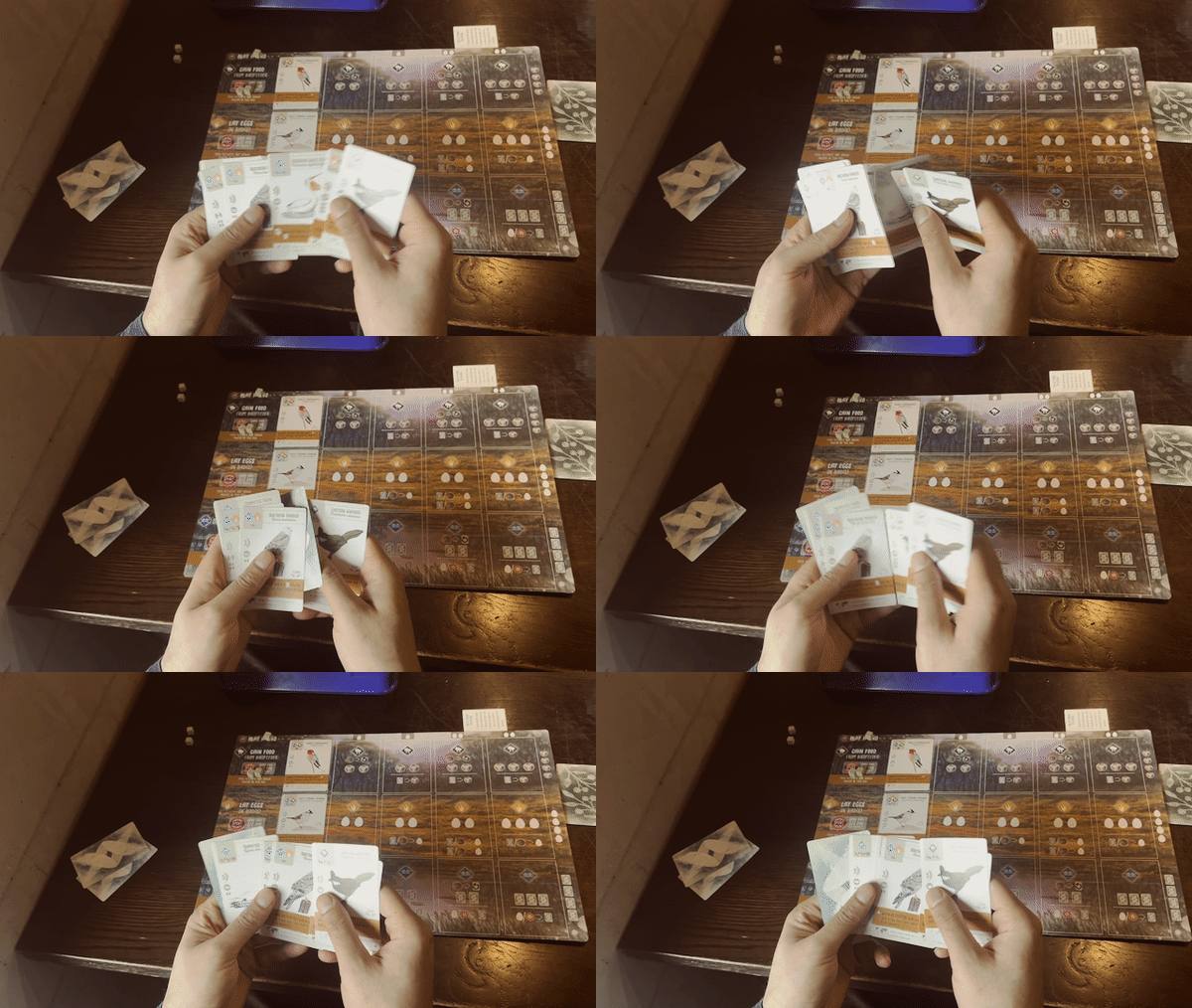
1. Rearrange the bird card in player’s hand
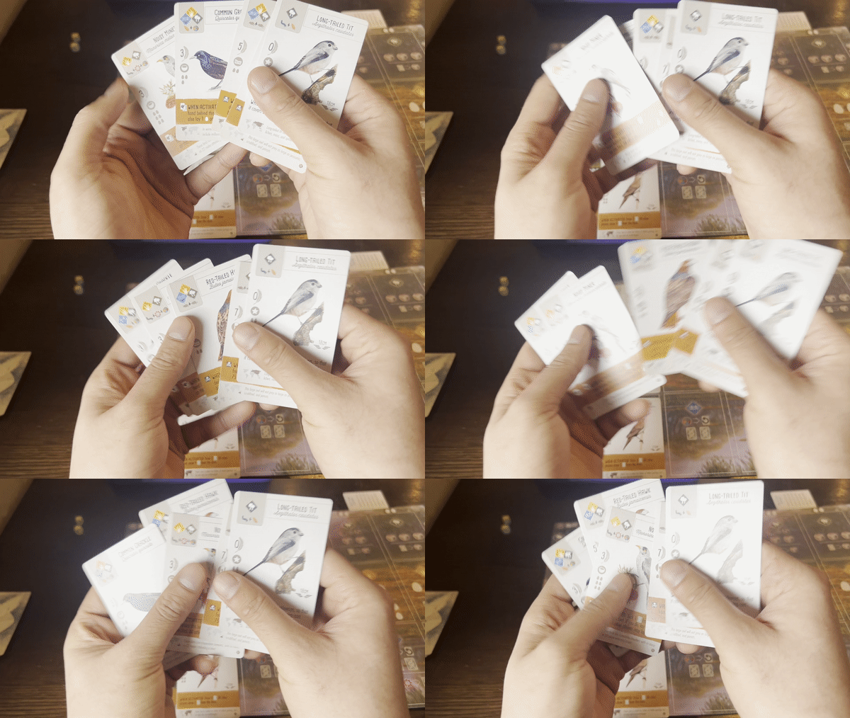
Participants use their extended and embodied cognition
to memorize the important information from the context of the game play with the material components of the game so that they can plan their strategies for the future turn. (Rogerson et al. 2018)
to memorize the important information from the context of the game play with the material components of the game so that they can plan their strategies for the future turn. (Rogerson et al. 2018)
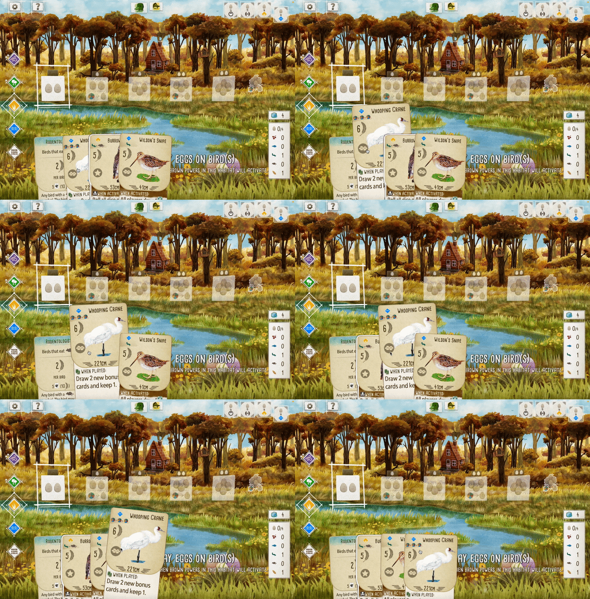
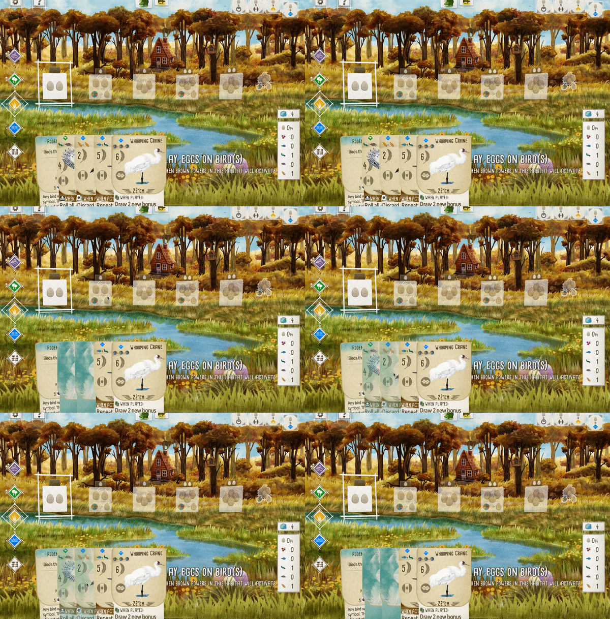
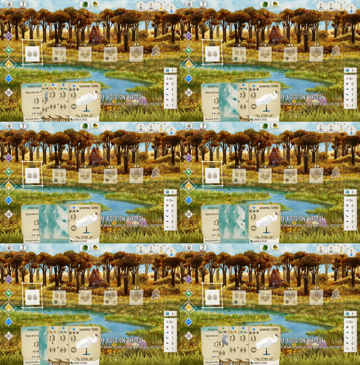
During board game play, users often rearrange their hand of cards based on personal preferences. This may involve organizing cards from highest to lowest points, grouping them by habitat or nest type, or combining different strategies to facilitate planning future moves. However, the digital version of the game lacks the ability for users to rearrange their cards and forces them to play in the order they were drawn. To support users' cognitive decision-making process, I propose the inclusion of a micro interaction that allows cards to be moved side by side within the digital hand.
2. Seperating the tucking or discarding card
By making choice and eliminating the possible options, each important aspect can be evaluated more carefully and do not have to consider the ones that are already eliminated.(Tversky, 1972)
3. Redesigning the cube representation
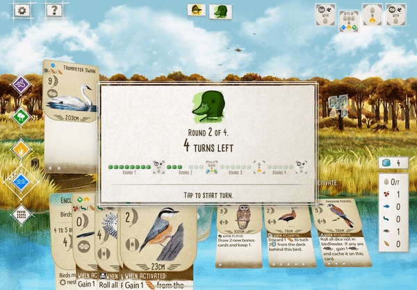
In the physical board game, a cube is used to represent each turn, allowing players to move it along as they take actions. For example, they might start by selecting an action from one of the habitats and then move the cube to activate the bird power associated with a previously played card. During my observation, I noticed that although there are three distinct statuses for turns - turns that have already been taken, the current turn being played, and remaining turns - the digital version of the interface only had two visual indications: transparent or non-transparent.
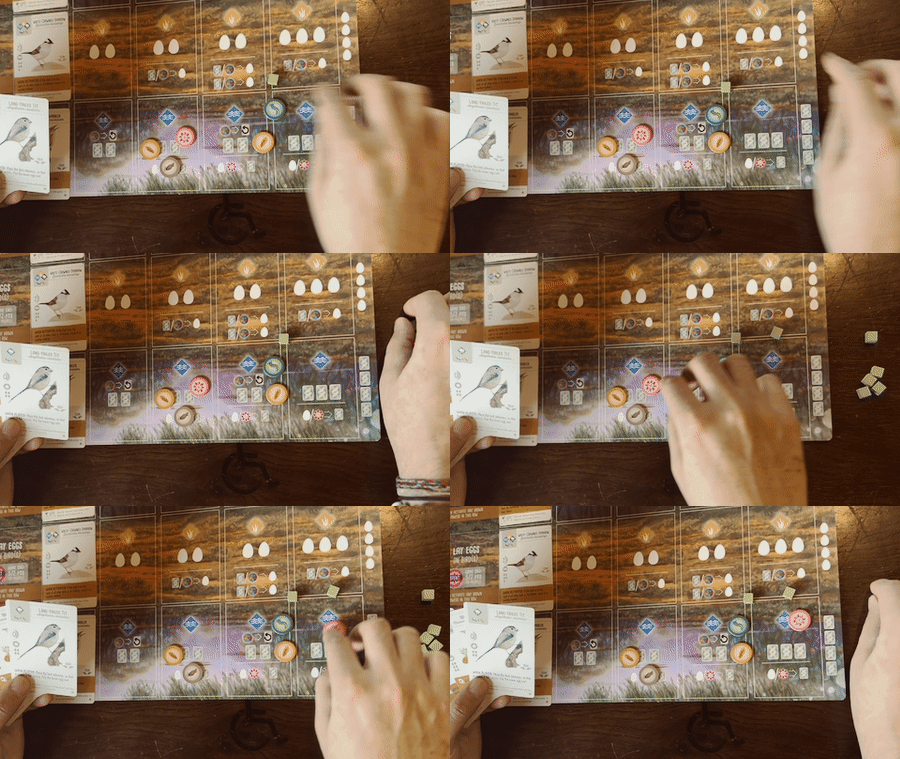
Also for the physical version, materiality of the game component is supporting the user’s cognitive process in decision making for the future turns with physical game components like cubes or food token by allocating certain resource to each cubes, which represent the player’s left turns.
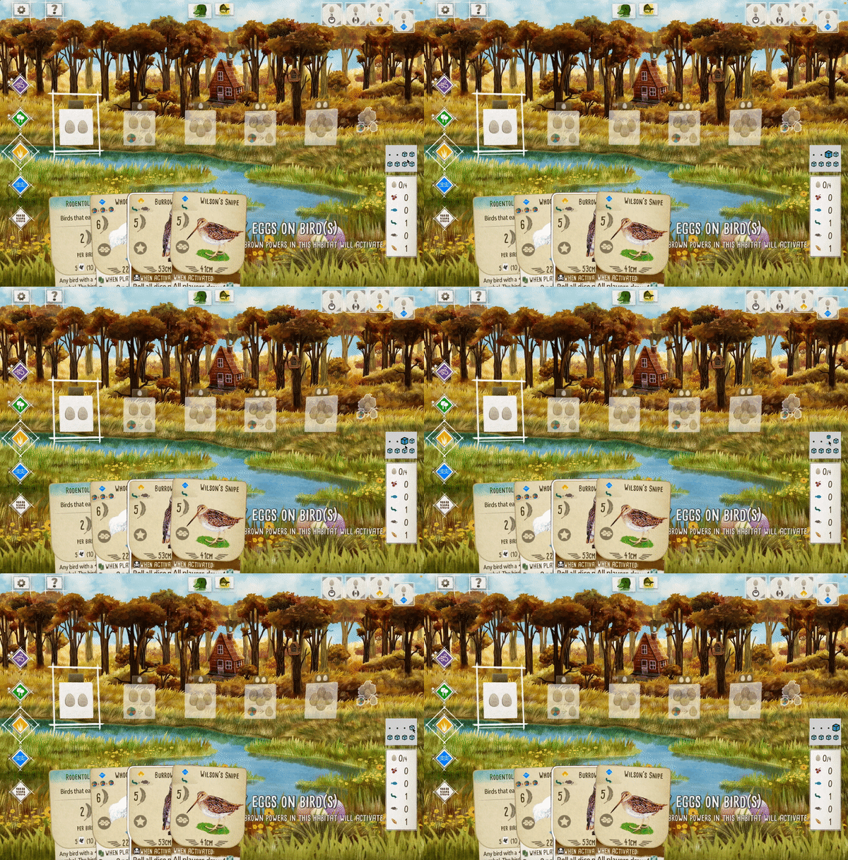
The user interface of the digital game version presented a challenge as it merged the concept of remaining turns into numerical values. This caused confusion regarding whether it referred to the current turn or the number of turns left, which significantly impacted strategic decision-making. To address this issue, I propose a design solution that involves using three different visual indicators for turns. The turns already taken can be represented by black dots, the current turn by a large colored cube, and the remaining turns by small light-colored cubes. This design approach will provide clarity regarding the number of turns the user has already taken and how many are left to play.
4. Designing communication and customaization tool
A notable aspect that players appreciate in physical board games is the social interaction it offers. Many individuals organize regular meetups to play the game, while others engage in group activities during social gatherings. However, in the digital version, there is a lack of in-game communication tools. As a result, those who view the game as a social activity often resort to playing in close proximity to one another or rely on external platforms like Zoom or Discord to communicate with fellow players.
The level of psychological immersion in a virtual environment is closely connected to the sense of presence, which refers to the user's perception of being present during the experience (Csikszentmihalyi, 2014). Creating an avatar can enhance self-identification and assist players in crafting the persona they desire (Arnett, 2010, p. 340).
Furthermore, to foster a sense of social presence, effective communication that influences intimacy and co-presence is vital (Short, Williams, and Christie, 1976).

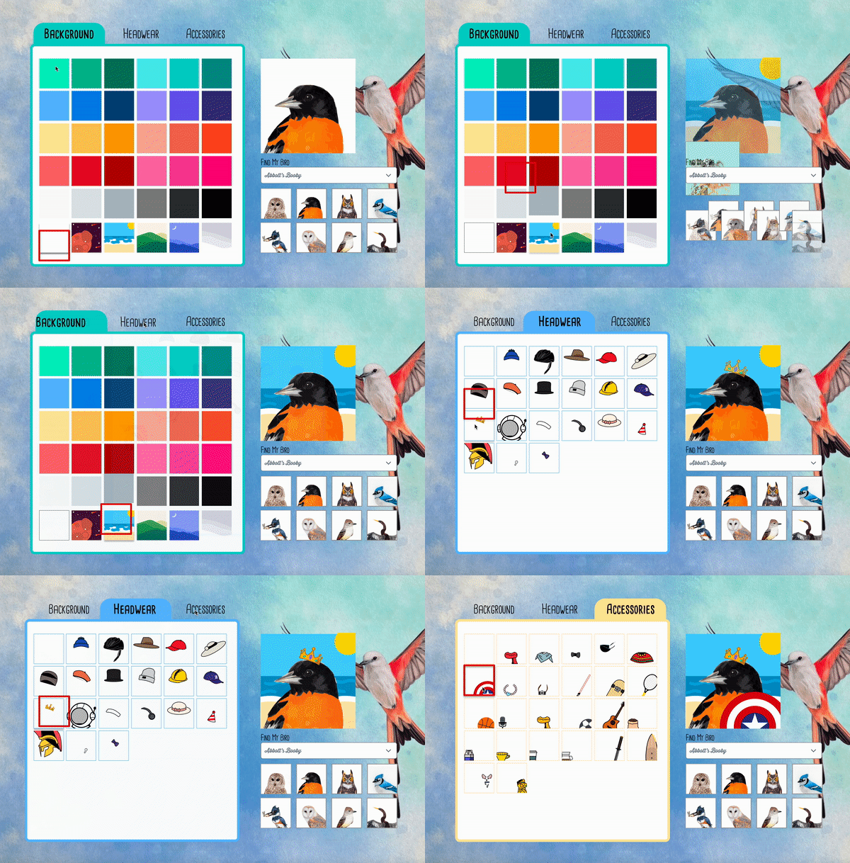

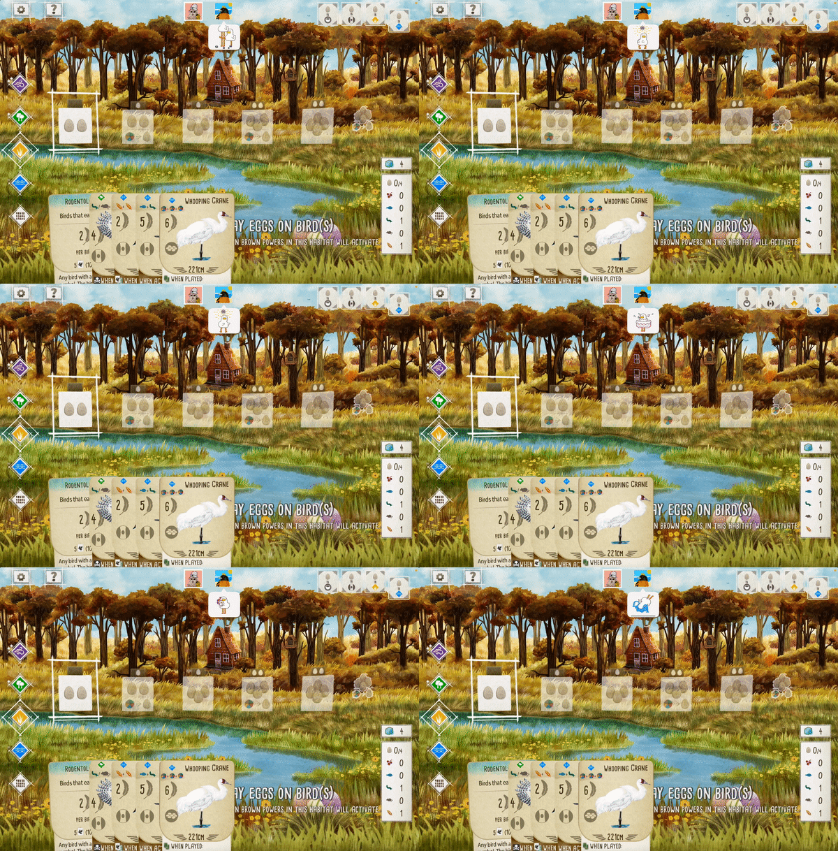
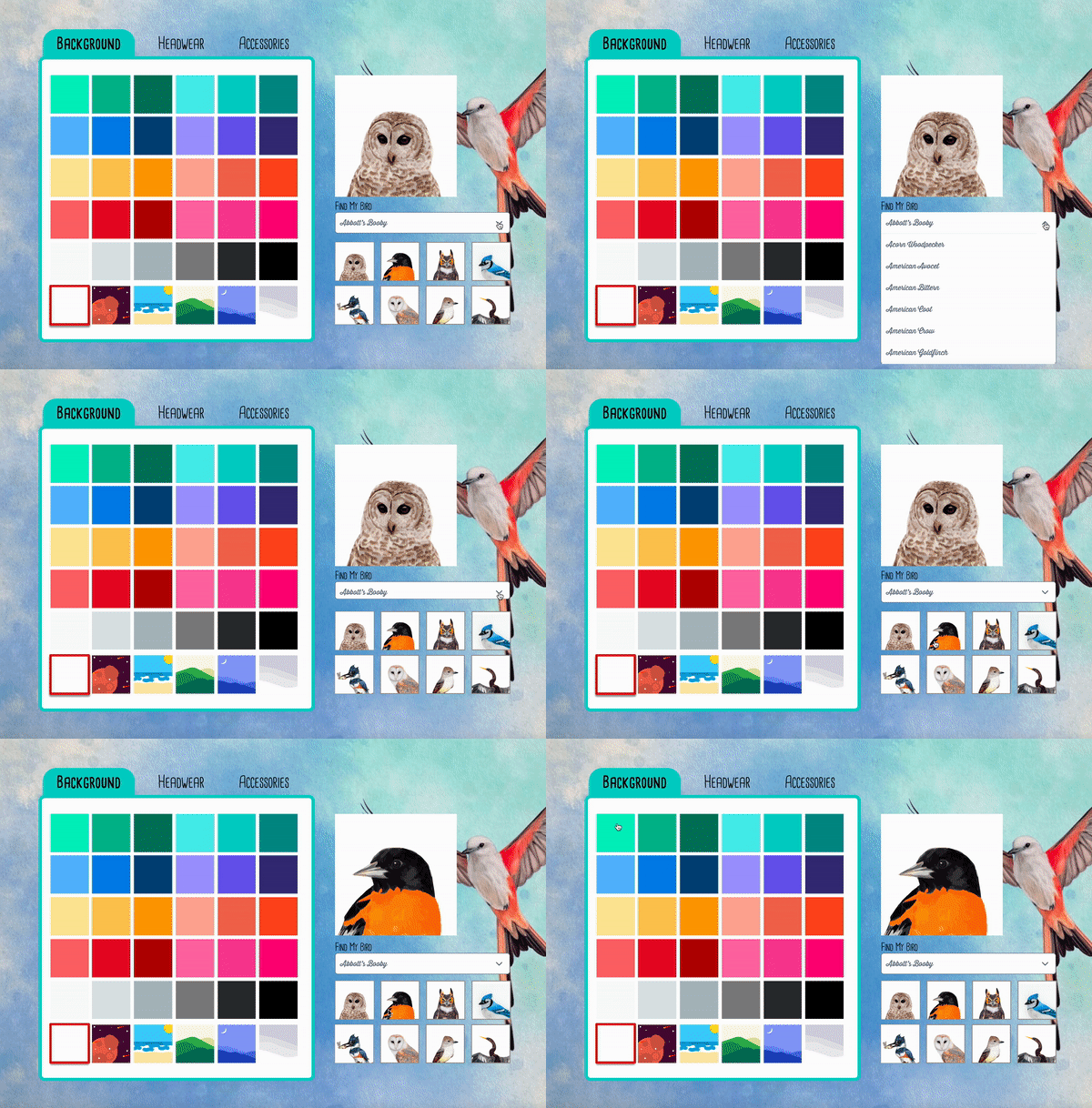
I developed a feature that allows users to personalize their profile characters using the bird options available in the game. Additionally, I included extra accessories and backgrounds to enable users to create their own unique persona within the game. In terms of communication, I opted for a simple emoji-based system rather than text-based communication. This choice was made to minimize the risk of potential insults or inappropriate behavior and to reduce the mental workload for users.
Design Iteration
1. Add hovering interaction to flipped cards

To streamline the process of checking flipped cards, I suggest implementing a hover interaction that reduces the transparency of the cards. This would allow users to view the card information without having to flip them back.
2. Combine the numeric system with the cube
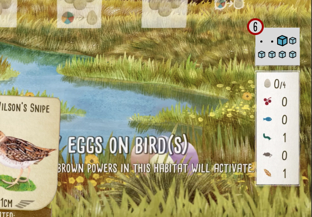
During the usability test, certain participants mentioned the need to manually count the remaining turns. To address this, I integrated a numeric system that allows users to quickly and accurately determine the specific status of each cube without the need for manual counting.
3. Add voice communication option
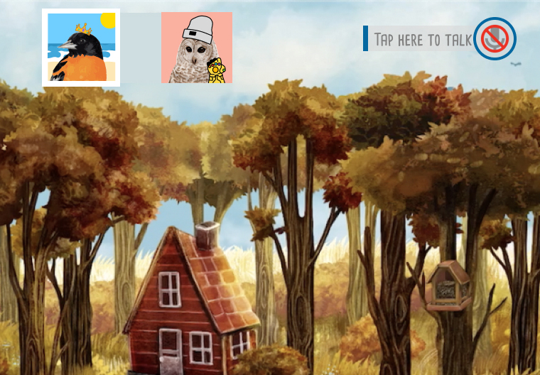
Feedback from usability test indicated that players desired the ability to engage in conversations about various topics beyond the game itself, especially when playing with familiar individuals. Drawing from a competitive analysis of game user interfaces, I refined the design by incorporating the option for voice communication, allowing players to have richer and more diverse conversations during gameplay.